Settings & themes
Open Settings from the top-bar ⋯ overflow menu.
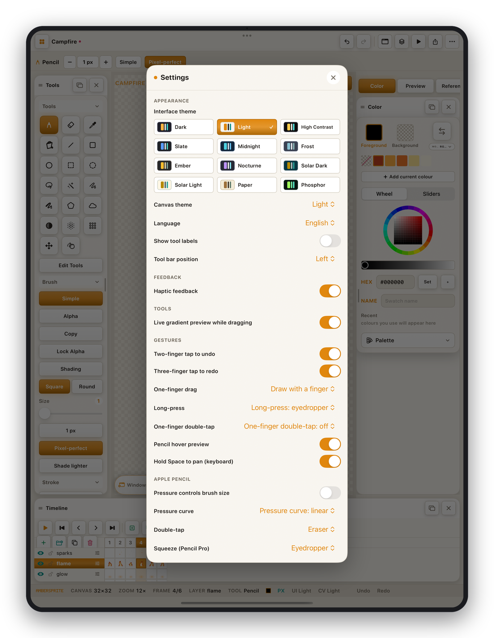
Appearance#
Interface theme#
A grid of twelve built-in themes, each with a live preview:
| Theme | Character |
|---|---|
| Light | Warm cream, amber accent — the default. |
| Dark | Cool dark, amber accent. |
| High Contrast | Pure black / white, for accessibility. |
| Slate | Neutral cool grey, blue accent. |
| Midnight | Deep indigo, teal accent. |
| Frost | Muted arctic blue-greys. |
| Ember | Warm retro dark, yellow / moss. |
| Nocturne | Purple-grey, violet accent. |
| Solar Dark / Solar Light | The Solarized pair. |
| Paper | Warm sepia — easy on the eyes. |
| Phosphor | Green-on-black CRT terminal. |
The top-bar theme button is a quick Light ↔ Dark toggle; the grid reaches every theme.
Canvas theme#
Sets the colour of the area around the canvas and the transparency checkerboard, independently of the interface theme.
Other appearance options#
- **Language*— the app's language (also picks which language this manual opens in).
- **Show tool labels*— text under the tool icons.
- **Tool bar position*— Left or Top.
Feedback#
- **Haptic feedback*— subtle taps on button presses and undo / redo.
Tools#
- **Live gradient preview while dragging*— see the gradient ramp update in real time (it is debounced, so no lag).
Gestures#
Covered on Gestures & Apple Pencil — one-finger drag behaviour, two/three-finger tap, long-press, double-tap, three-finger drag, hover preview, hold-Space to pan.
Apple Pencil#
Pressure → brush size, pressure curve, double-tap and squeeze actions. Also covered on Gestures & Apple Pencil.